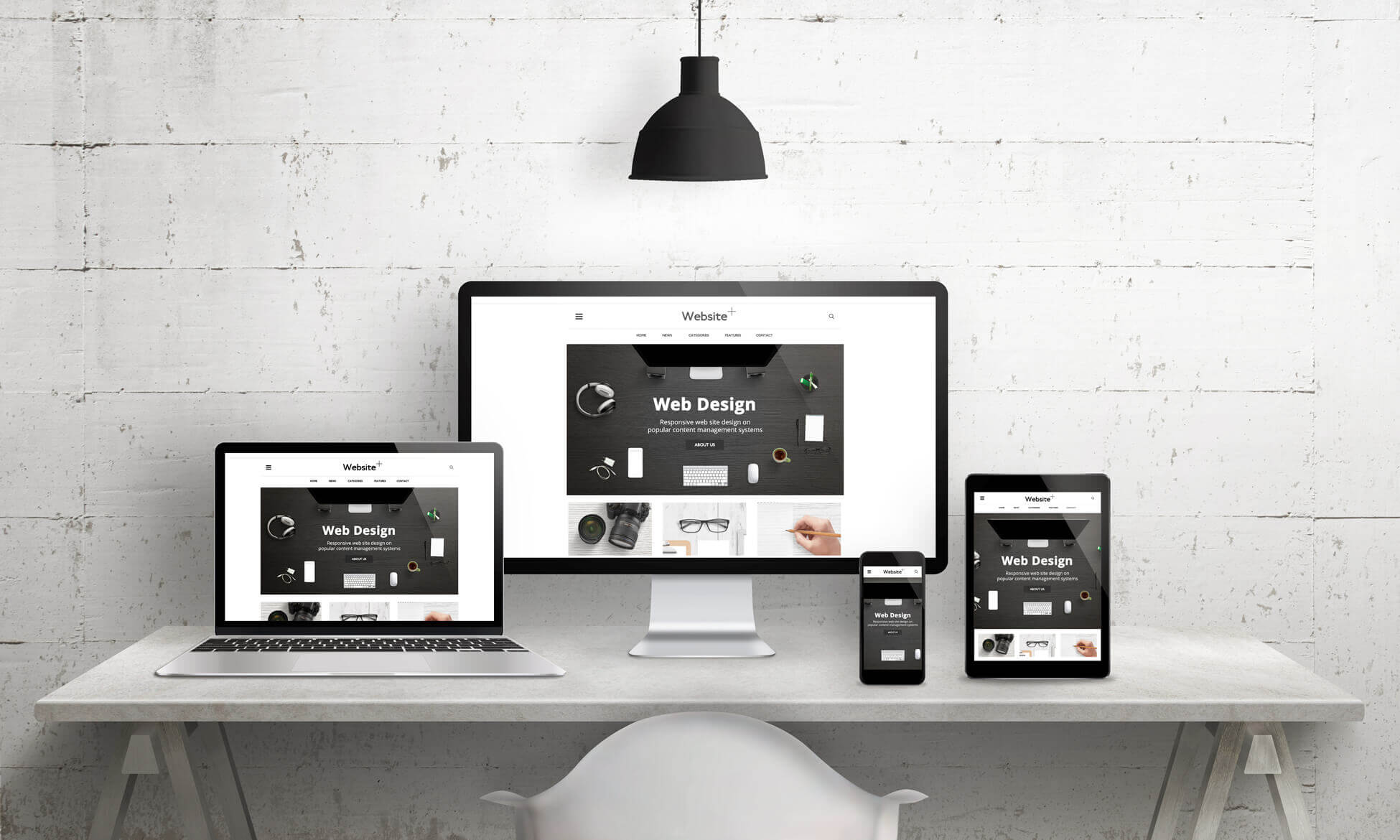
When we look at a new clients existing website, one of the first things we do is look at whether or not it is responsive. A responsive website is one which is designed to automatically work on any device, and when we say work we mean work well!
Not all responsive websites are the same. Responsive website development has come a very long way in a short period of time. From the first time Google hinted that mobile friendly and responsive websites would affect a website’s ranking, developers started working on ways to minimise the work needed to make a website responsive.
If you have a website that is two or three years old you might actually have a “mobile friendly version” of your website. This means you would have had to create two versions of your website. These days however, modern web design allows us to create one version of your website which responds to the device it is being used on and automatically adjusts itself. To do this you need to use the latest website software which allows for responsive design.
At Hills Web Design we create 100% responsive websites which also pass the Google Mobile Friendly Test and are optimised for all devices, whether it’s iphone, android, ipads, laptops and PCs. There’s a lot to get right and we have the passion and expertise needed to give your new website the attention to detail that it deserves.